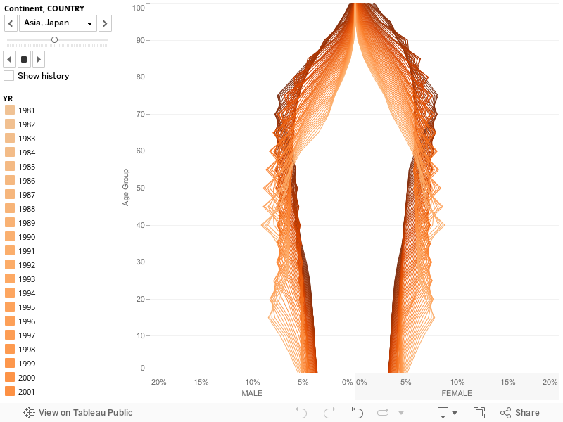
Well, here is my first chart in Tableau, finally! After publishing my experiments with population pyramids (using Excel), I thought I could try Tableau Public with the same dataset from the US Census Bureau. Here is the result. I never really played before with Tableau Public and it took my less than an hour to upload the data and make this chart, without reading a manual or watching a tutorial (changing line colors was the hard part). It says a lot about its usability.
Population Pyramids 1981-2050
Sheet 1 – Asia, Japan
So, what do you think? There’s a lot to learn and your comments are much appreciated.
You may also be interested in:
via excelcharts.com